- Year
- 2020
- Research direction
- Data as Lived Experience →
- Role
- Mobile visualization · Public communication
- Team
- Fan Xiang · Shunshan Zhu · Zuocheng Ren · Rui Wang · Hanlu Ma
- Source
- DXY Doctor · Tencent News
- Includes
- Interactive visualization · Mobile experience · Video · Paper
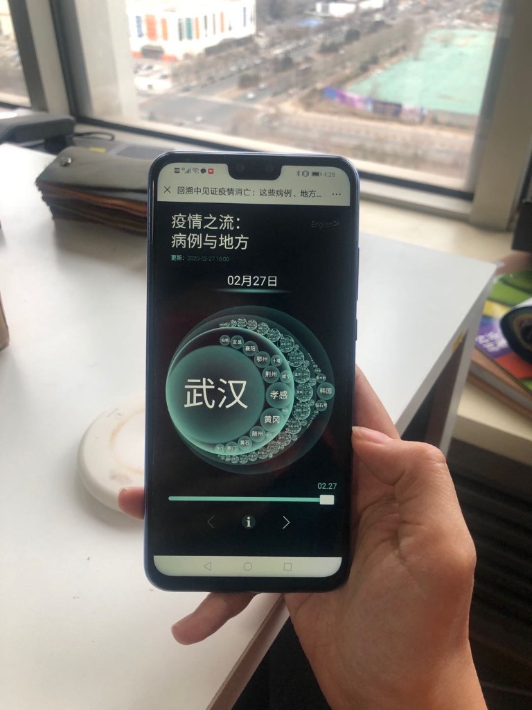
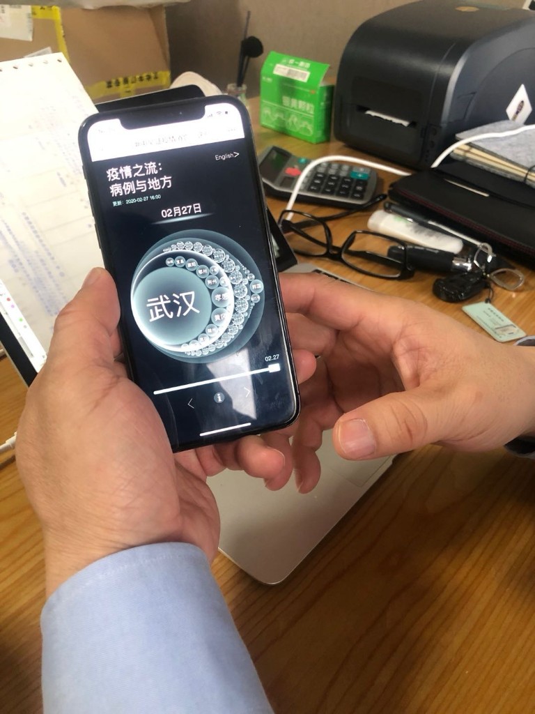
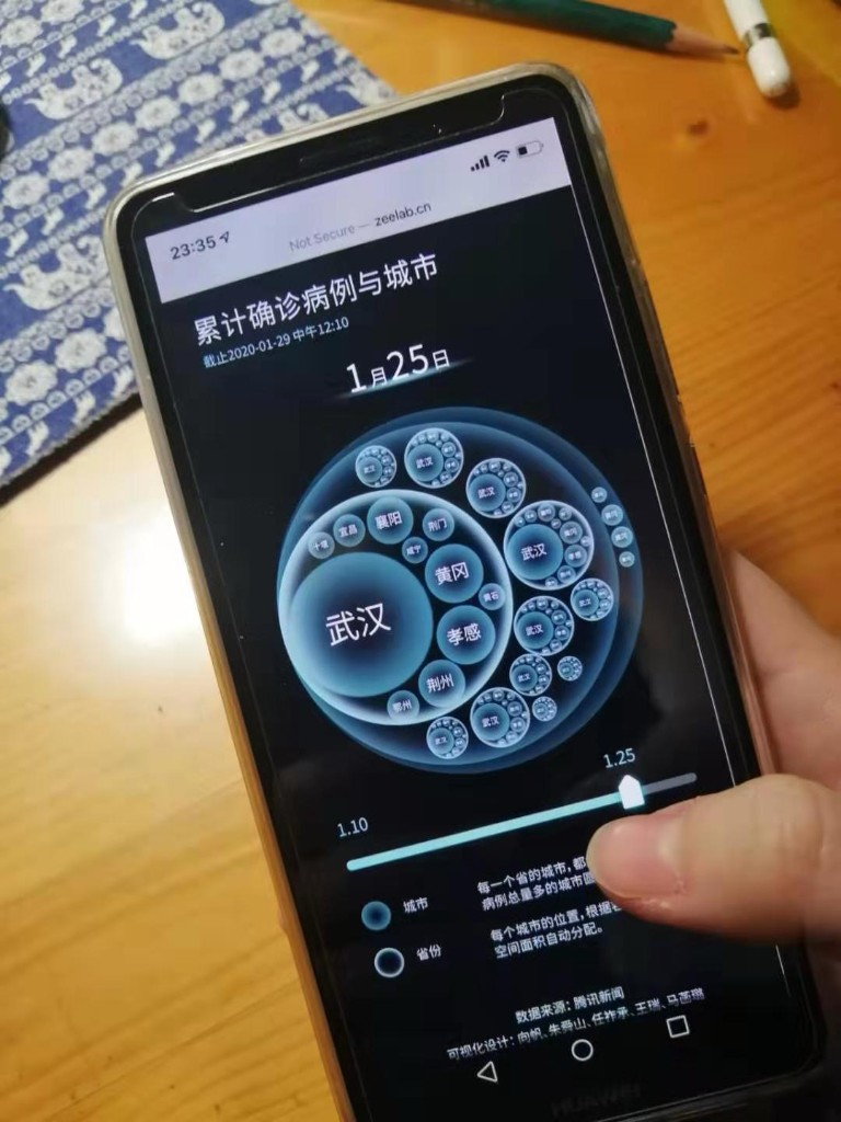
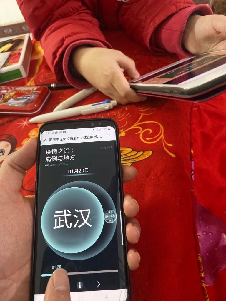
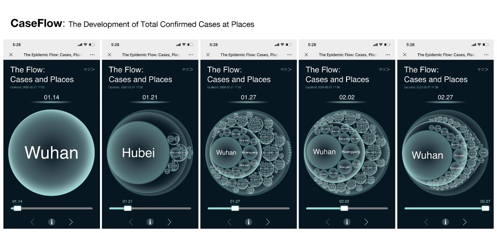
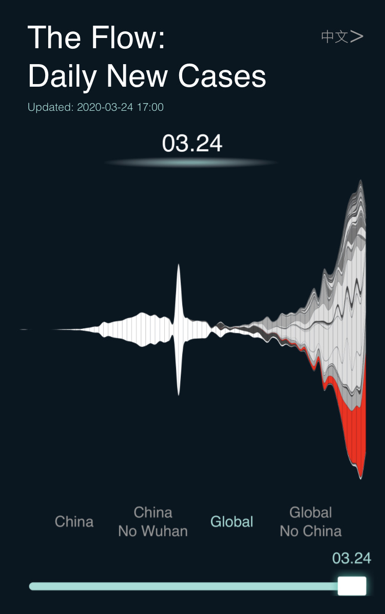
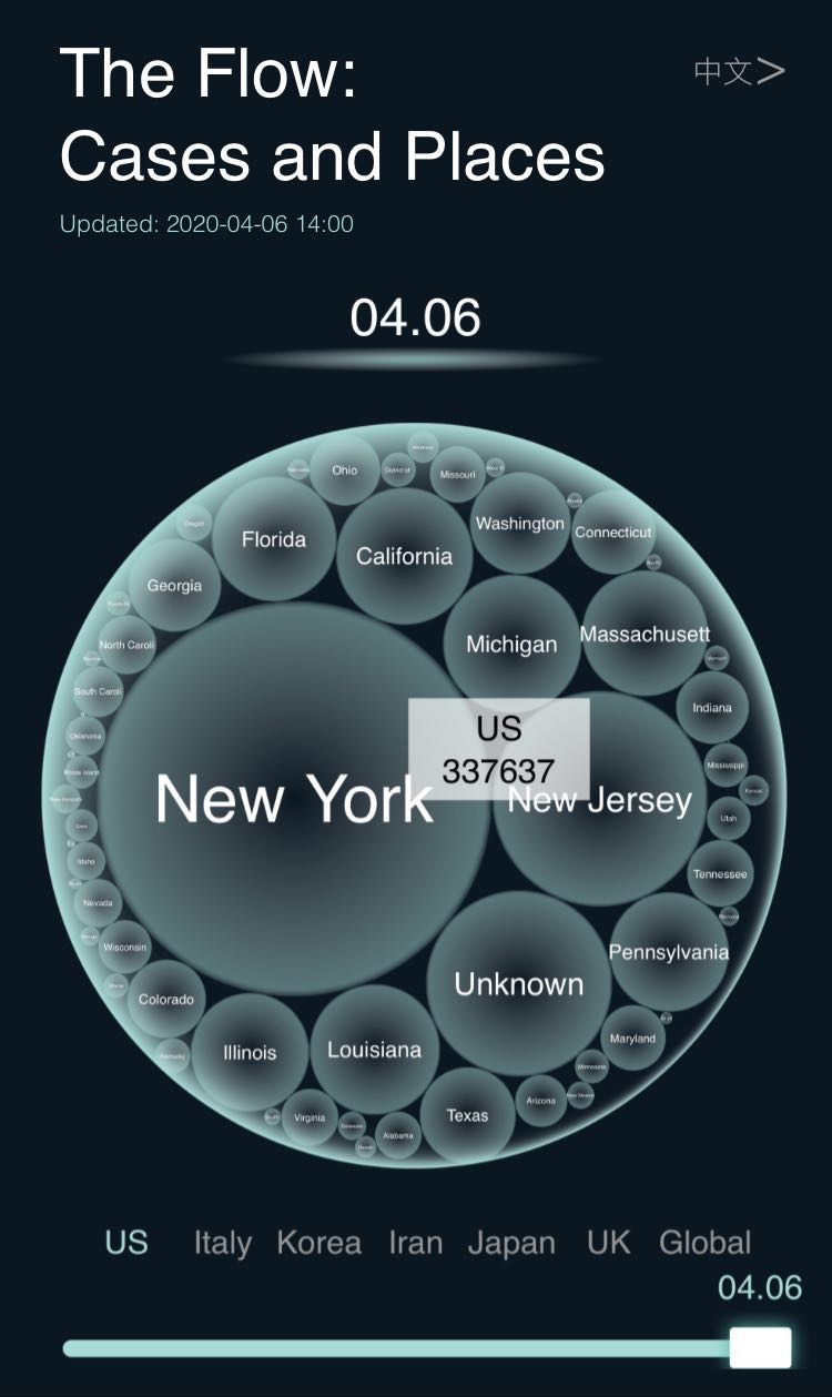
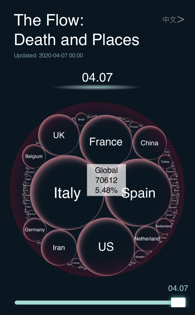
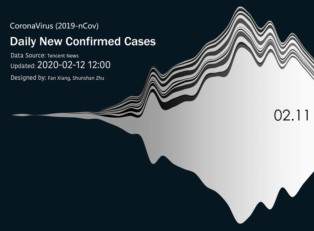
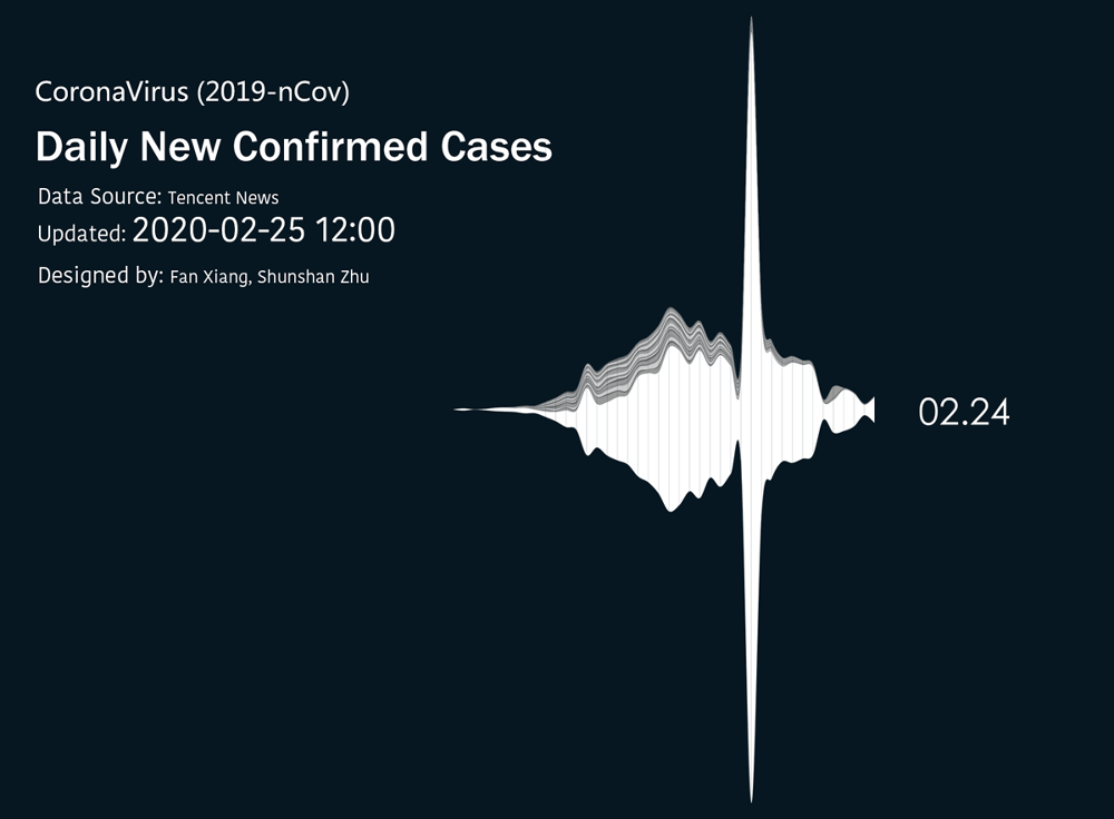
Created during the early COVID-19 outbreak, COVID19 CaseFlow turns daily new cases into a mobile streamgraph, allowing viewers to trace the changing relationship between time, place, and magnitude.
Original project record
View archived page ↗- Initiated on January 23, 2020, using data published by Tencent News.
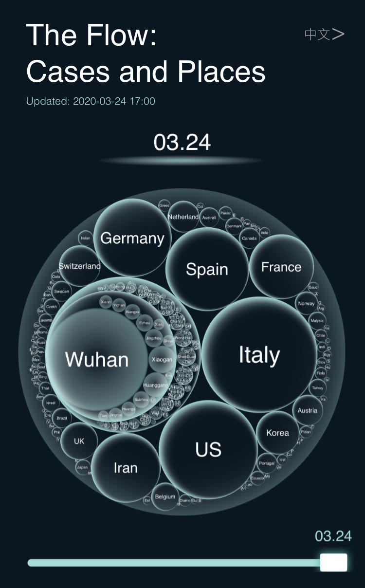
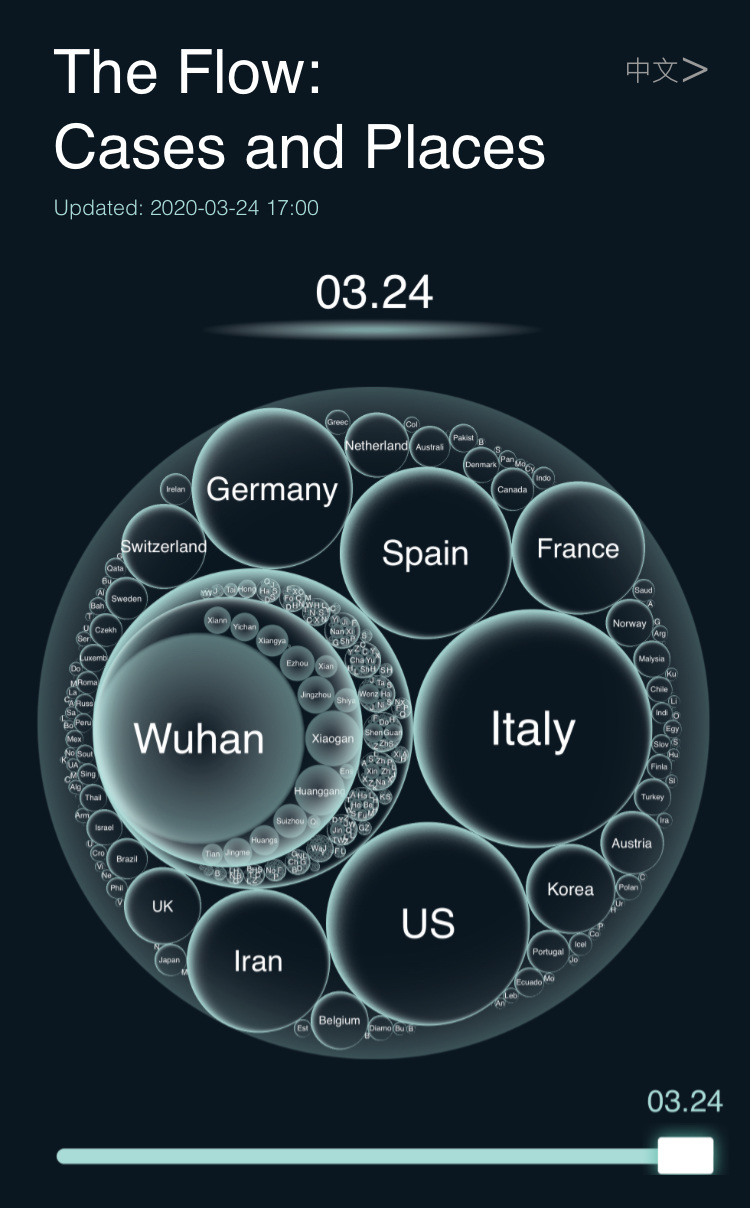
- Combines Circle Packing (region) and ThemeRiver / streamgraph (time) views designed for mobile reading.
- The first static visualization received 1.5 million views after promotion by Tencent News.
- Related paper: COVID19 CaseFlow: Understanding Stream Graph in Visualization, Digital Humanities, 2020.
Beyond maps and line charts
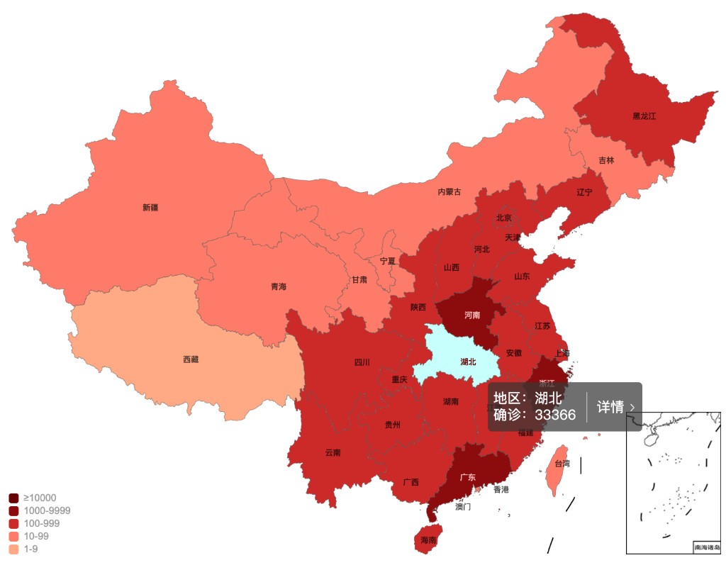
During the first weeks of COVID-19, maps and line charts dominated public reporting. CaseFlow began on 23 January 2020 by asking whether daily new cases could instead reveal the outbreak’s temporal shape—its sudden growth, fluctuation, decline, and long tail.
A changing data infrastructure
Early figures were collected manually from DXY Doctor. Tencent News data was used from 27 January, followed by an automated interface from 30 January. The project therefore developed alongside the changing availability, geography, and reliability of official information.
Choosing the shape of the flow
Four stacked-chart layouts were tested with the accumulating data. ThemeRiver and streamgraph forms produced a compelling overall contour, but their appearance changed with proportion and extreme values. When Hubei reported 14,823 new cases on 13 February, the design preserved the spike rather than smoothing the image into false balance.
Making weak signals visible
Because Hubei’s values obscured smaller regions, the project added four geographic views: China, China without Hubei, the world, and the world outside China. Restrained greys reduced color hierarchy, while selectable layers, a time slider, animation, and detail panels supported closer reading on phones.
Publishing through three media
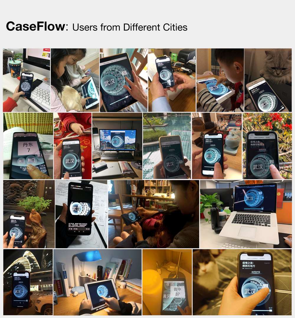
The work appeared as WeChat Moments posts, public-account articles, and an independent interactive page. Between 28 January and 5 March, seventeen articles received more than 180,000 reads; the website recorded 29,223 unique visits, 87 percent from mobile devices.
Feedback becomes part of the experiment
Viewers imagined the final contour as a bottle, flower, bat, fish, or other living form; they also questioned accuracy and requested comparisons. These responses show visualization acting as an independent public medium. Innovation here came not from inventing a wholly new chart, but from adapting an established form to the data, emotions, and constraints of a particular crisis.